

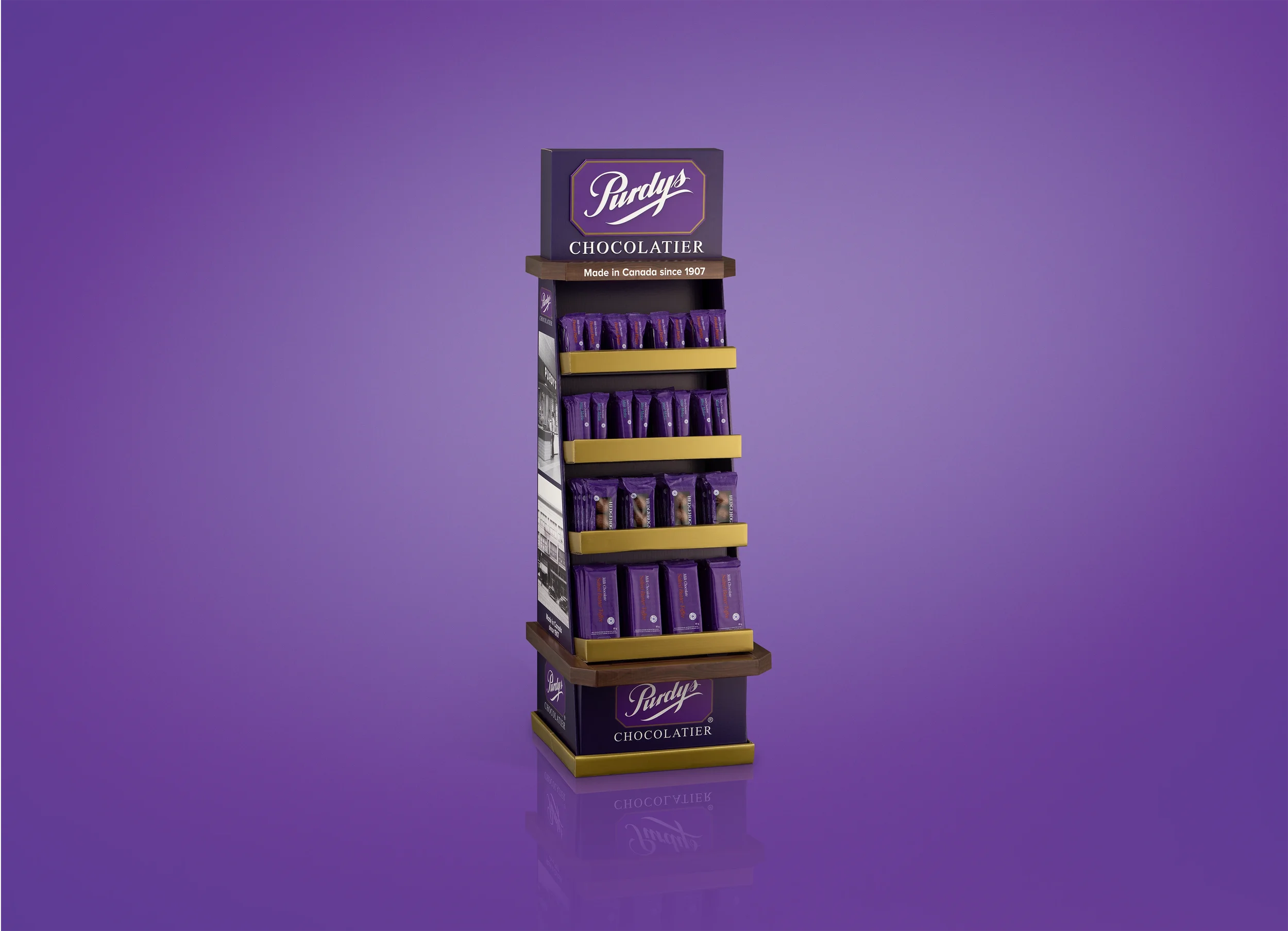
Client: Purdys Chocolatier | Brand: PurdysPurdys finds
its sweet spot
Bringing the Purdys experience to grocery retail with a display built to stand out and sell.
A New Place to Show Up
Purdys was moving into select Save-On-Foods locations across Canada. The opportunity was to take everything distinctive about the brand - its heritage, premium feel and unmistakable identity, and make it work in a completely different retail environment.
Built From the First Sketch
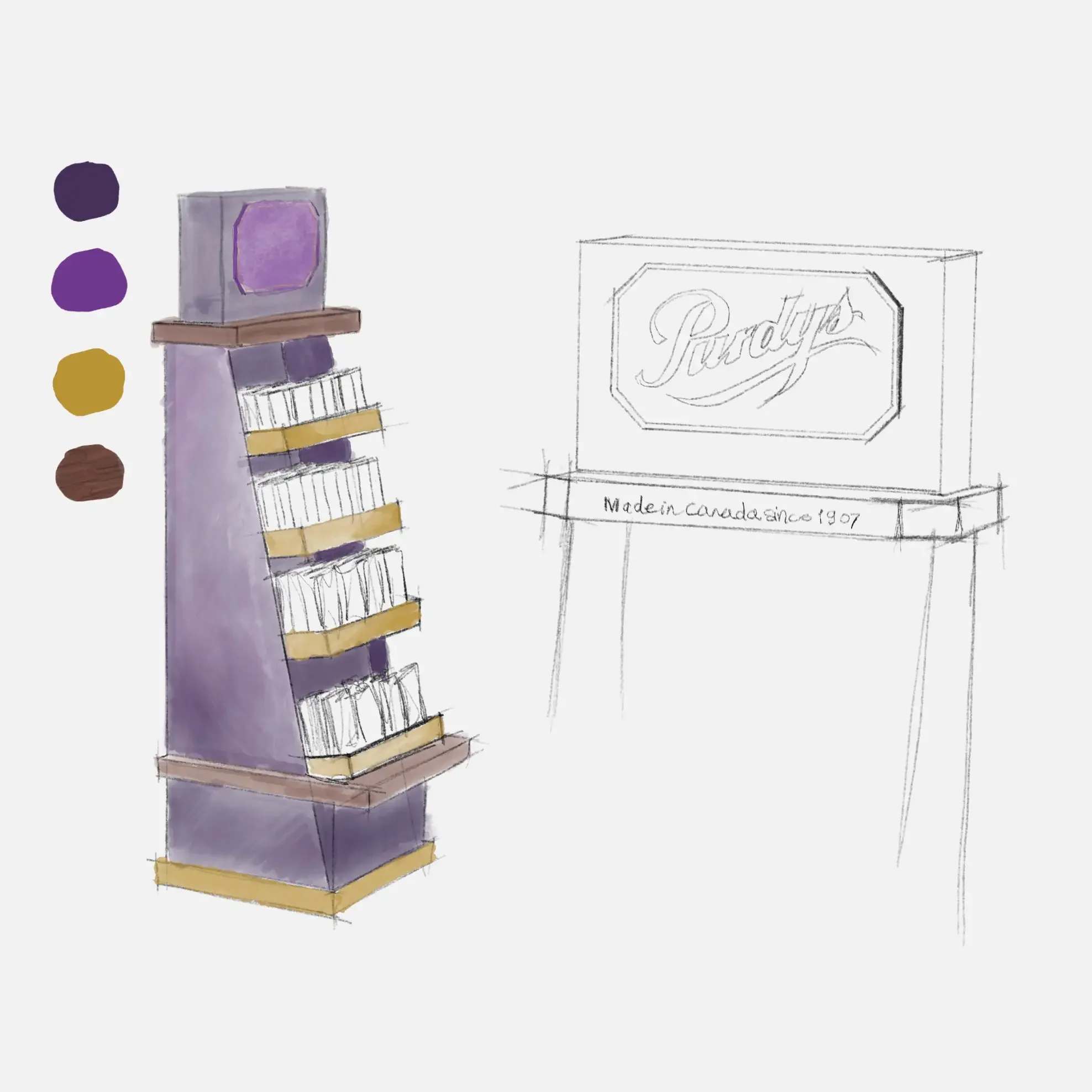
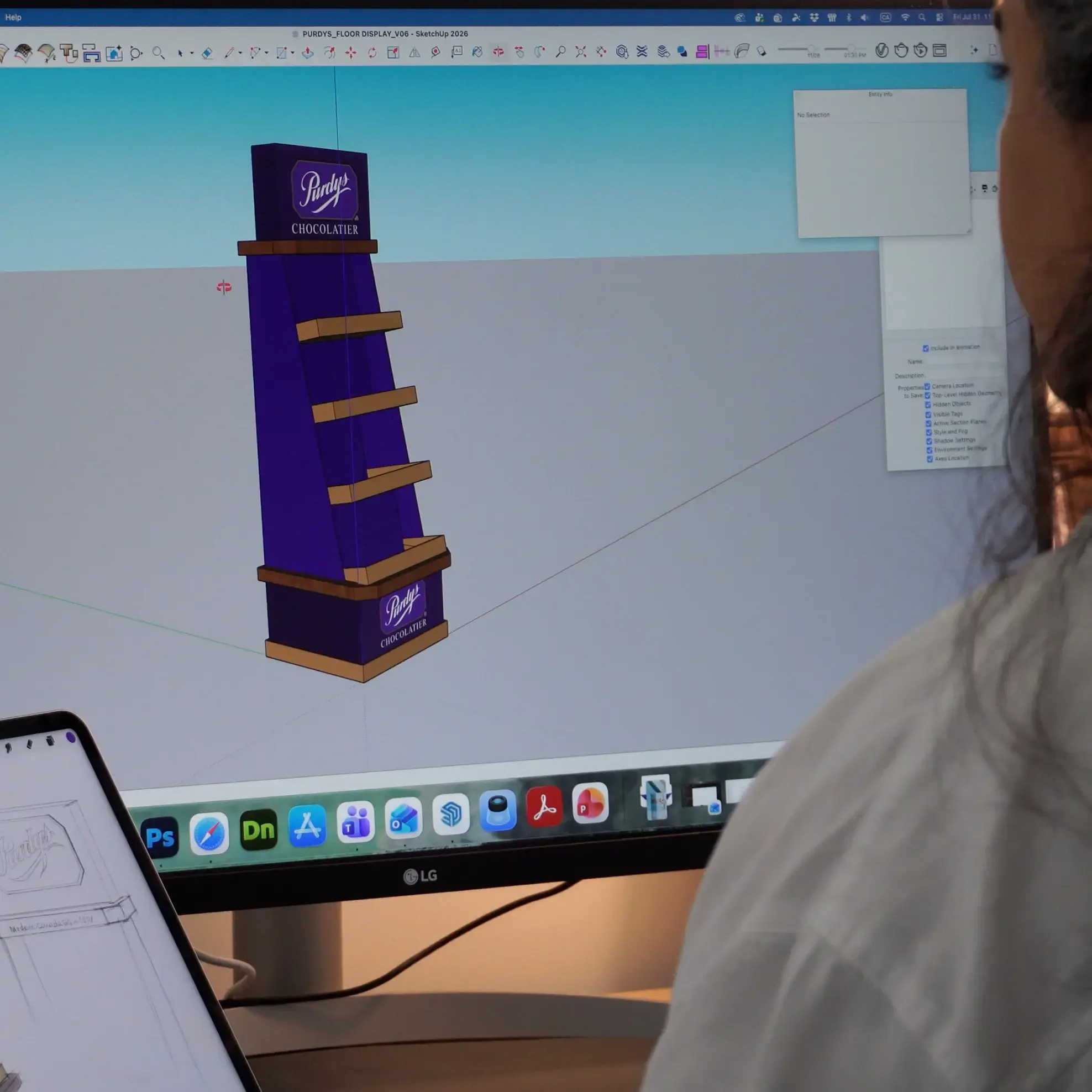
The process started with more than how the display should look. From the first sketch, we were thinking about structure, production and how the display would work in-store. Creative and practical decisions happened together, so the idea could keep moving forward without losing what made it good in the first place.
Premium Meets Practical
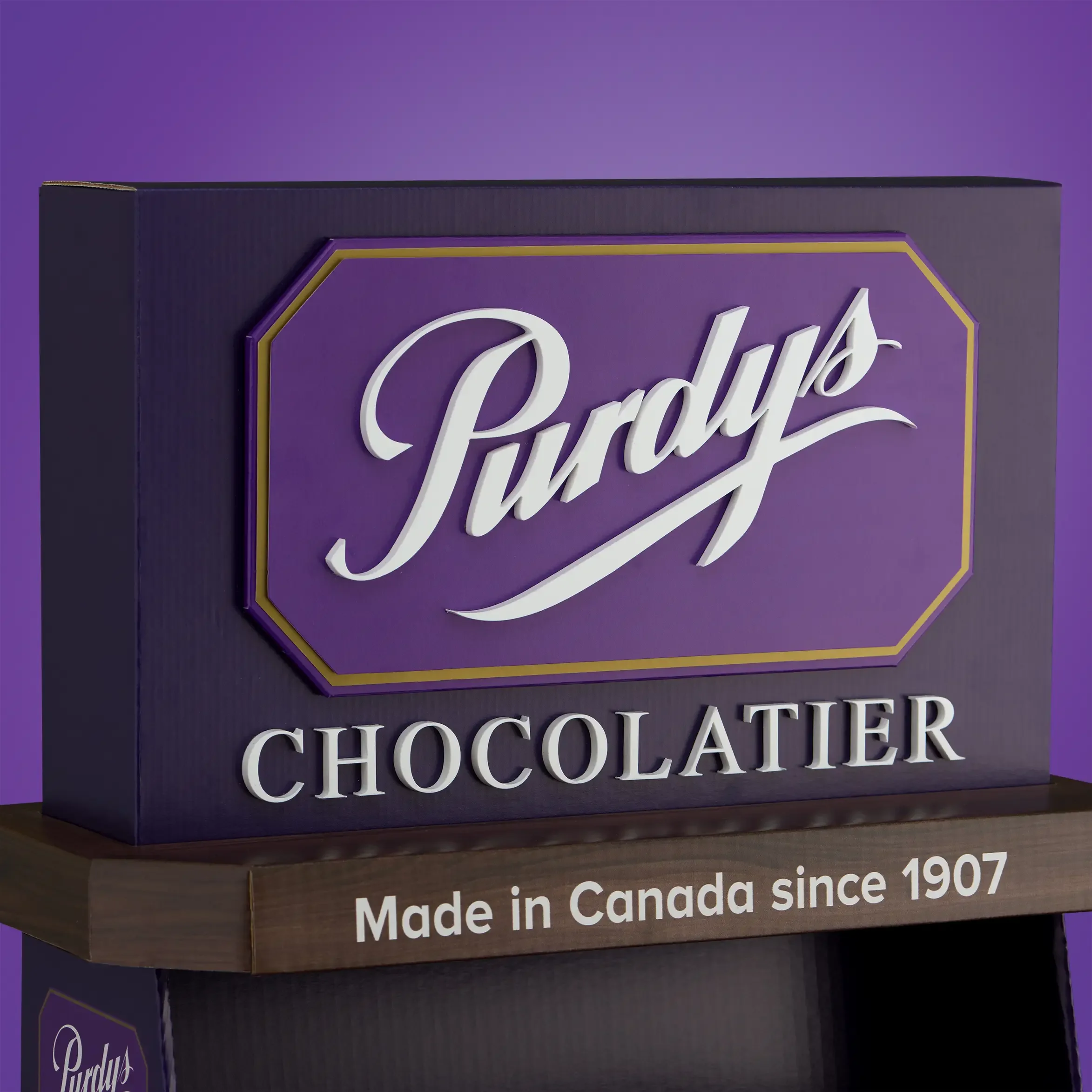
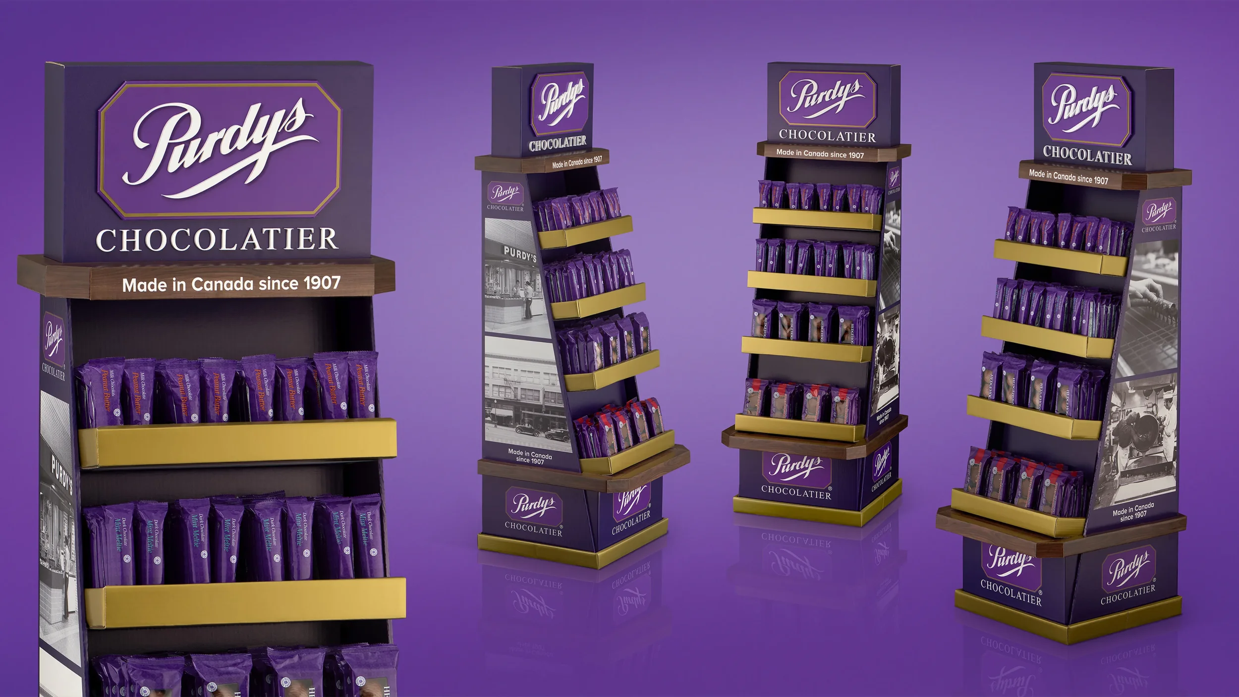
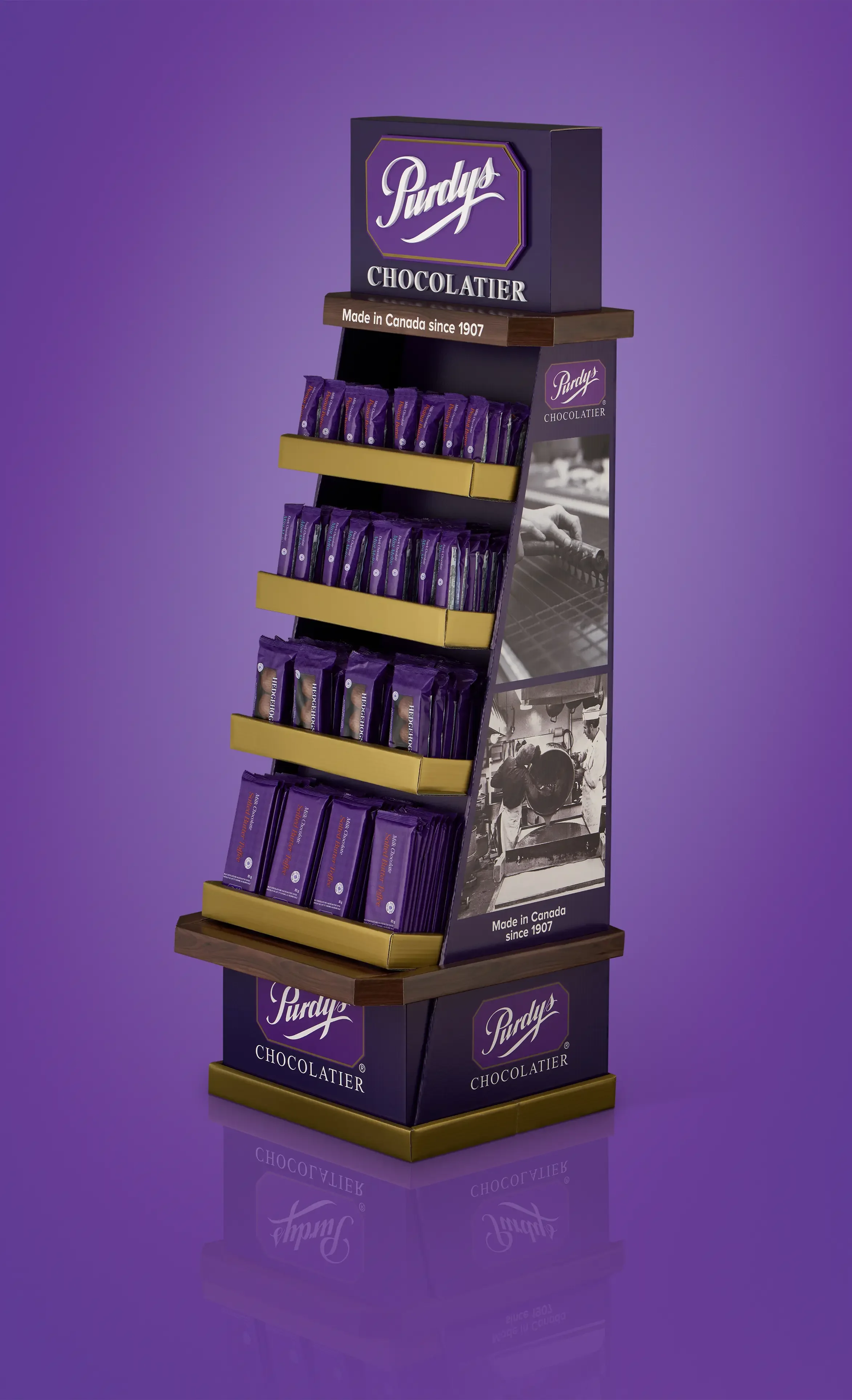
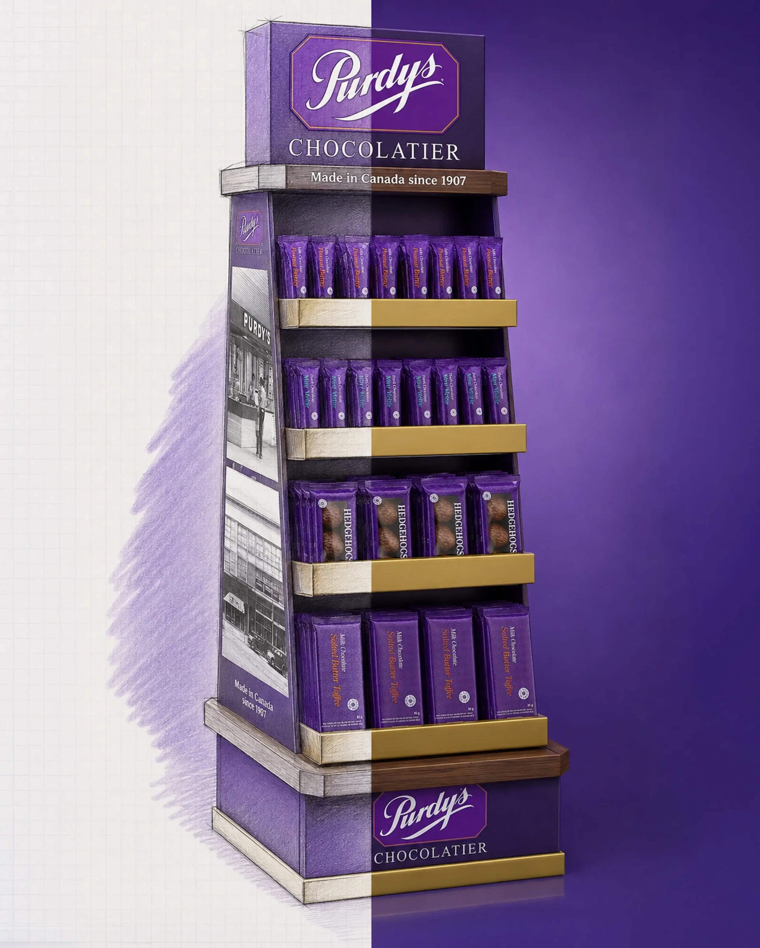
Rich Purdys purple, gold accents, embossed branding and angled shelves brought the brand to life with a premium finish and clear product presentation. Corrugate kept the display lightweight and retail-ready, while the compact footprint and accessible shelving made it easy to place, shop and replenish.
True to the Original
From hand sketch to 3D design to the finished piece, the original thinking stayed remarkably intact. The result brought the look and feel of Purdys into grocery retail in a way that felt considered, distinctive and completely buildable.
Because a great render can sell the idea. The display still has to sell the product.
Got an idea worth building?
Our designers think beyond the render—bringing creative, structural and production expertise together from day one.