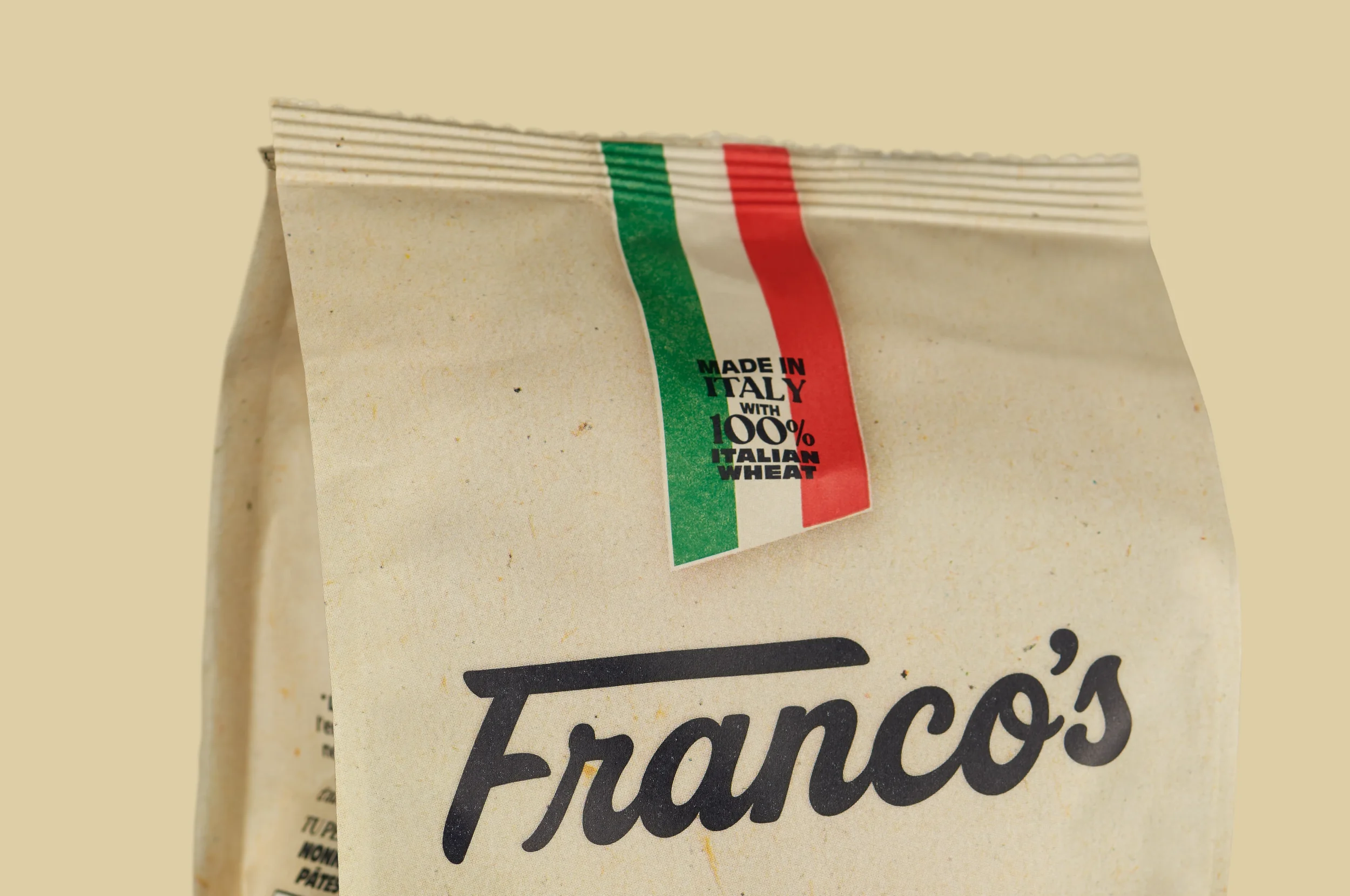
Client: Jolly Belly Foods | Brand: Franco’s PastaGood Taste,
Better Packaging
Making sure Franco’s didn’t get lost in the sauce.
Starting With a
Blank Bag
When the project began, the pasta didn’t even have a name. Jolly Belly Foods needed to turn an idea into a retail-ready brand — complete with a distinctive identity and a packaging system that could work confidently across six different pasta shapes.
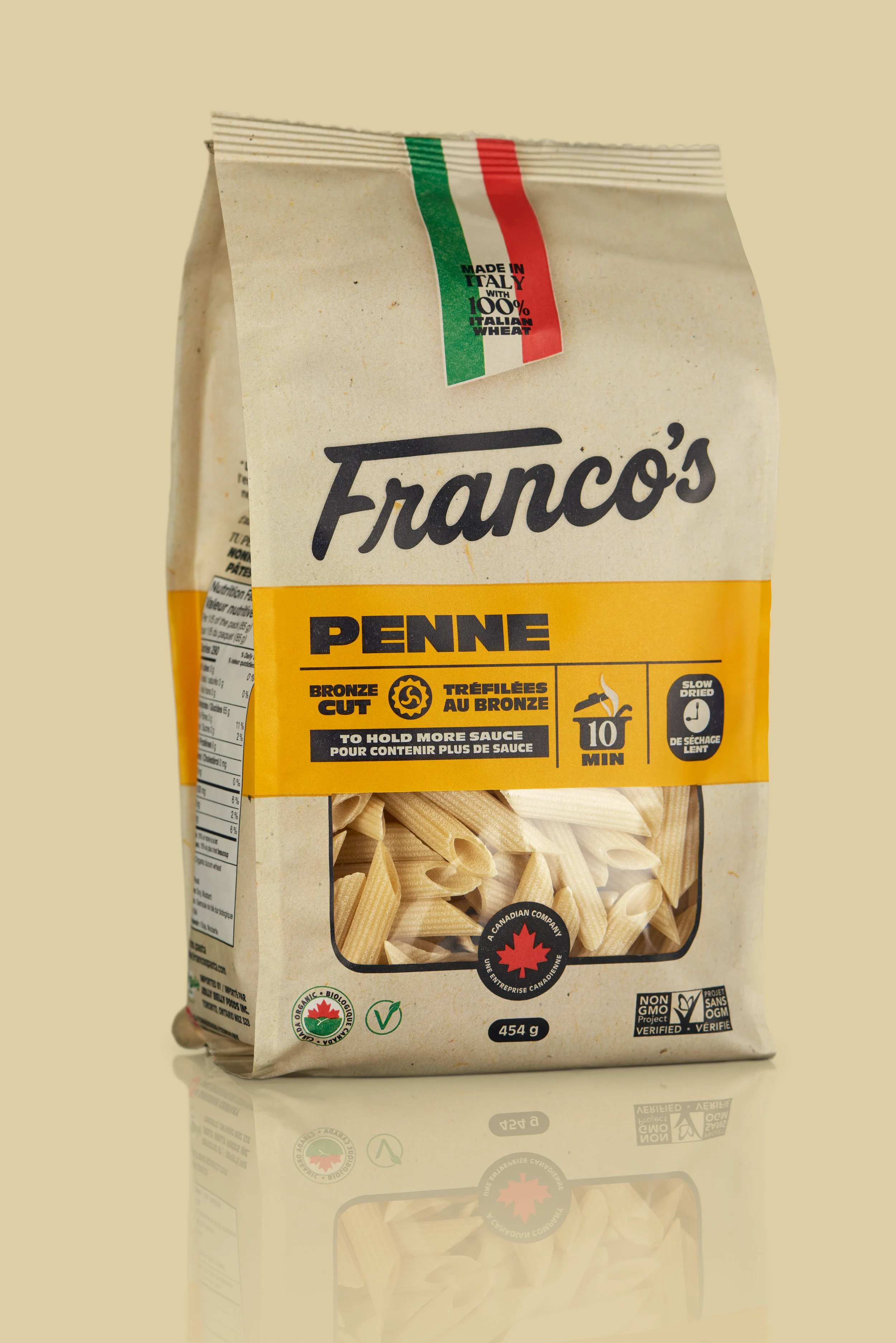
A Brand With
Some Bite
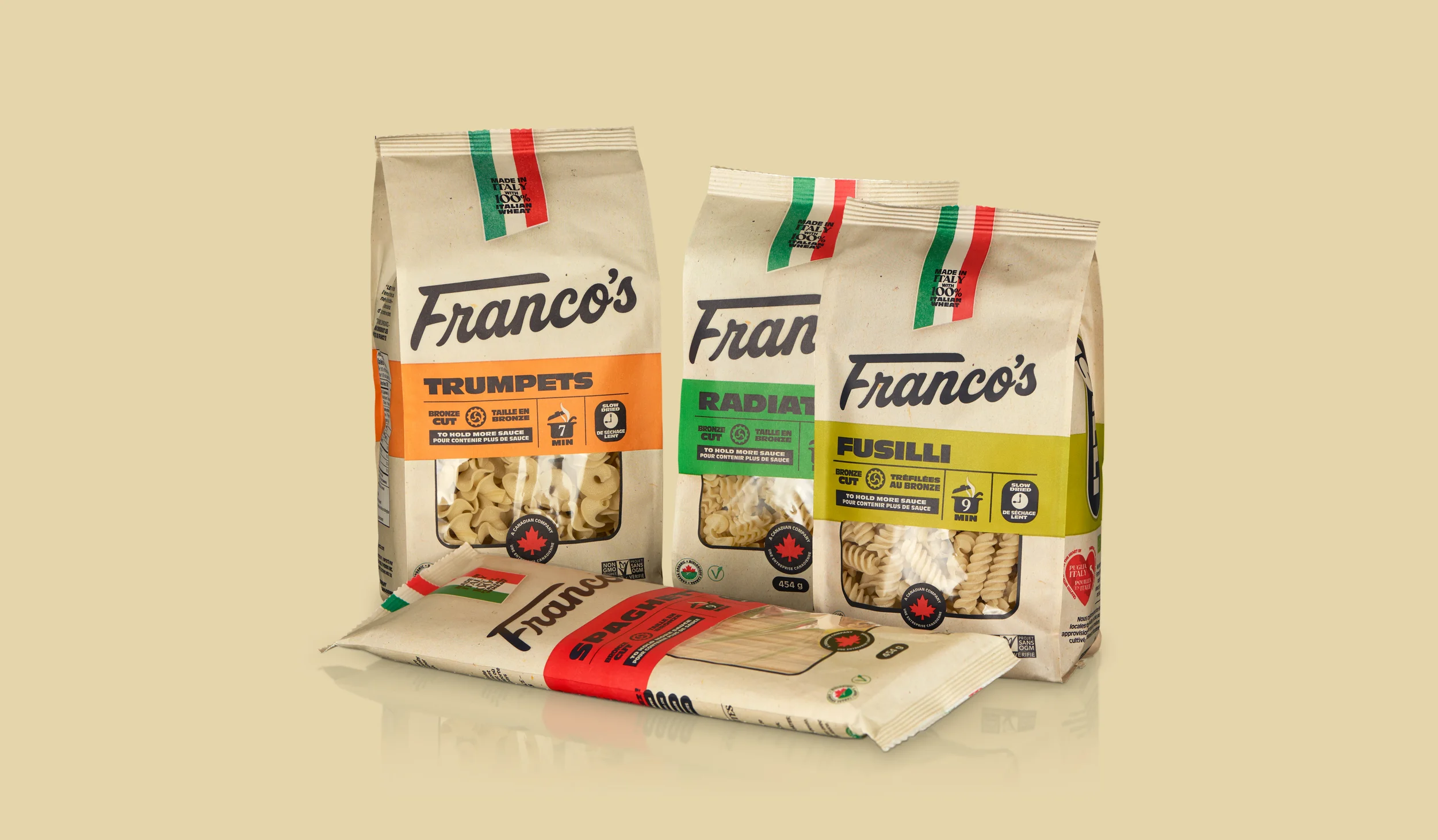
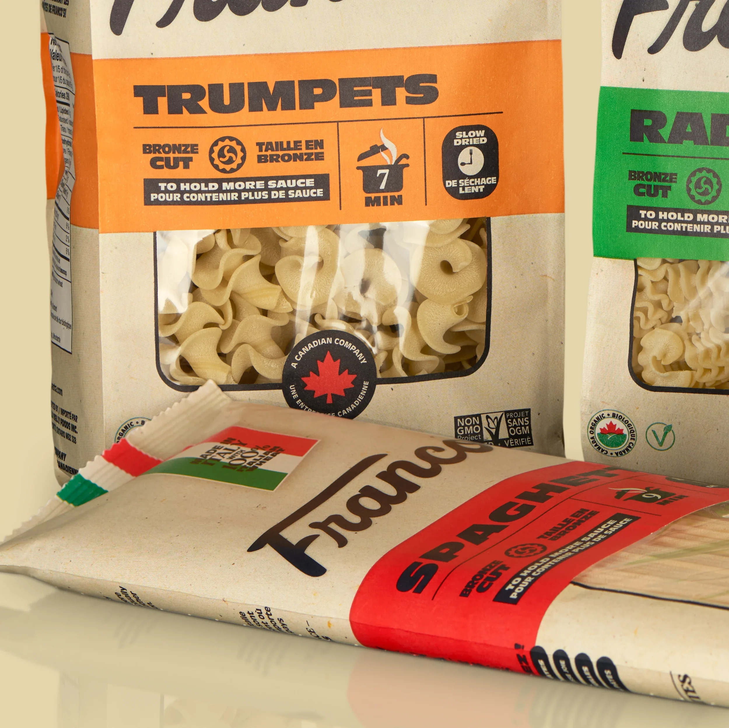
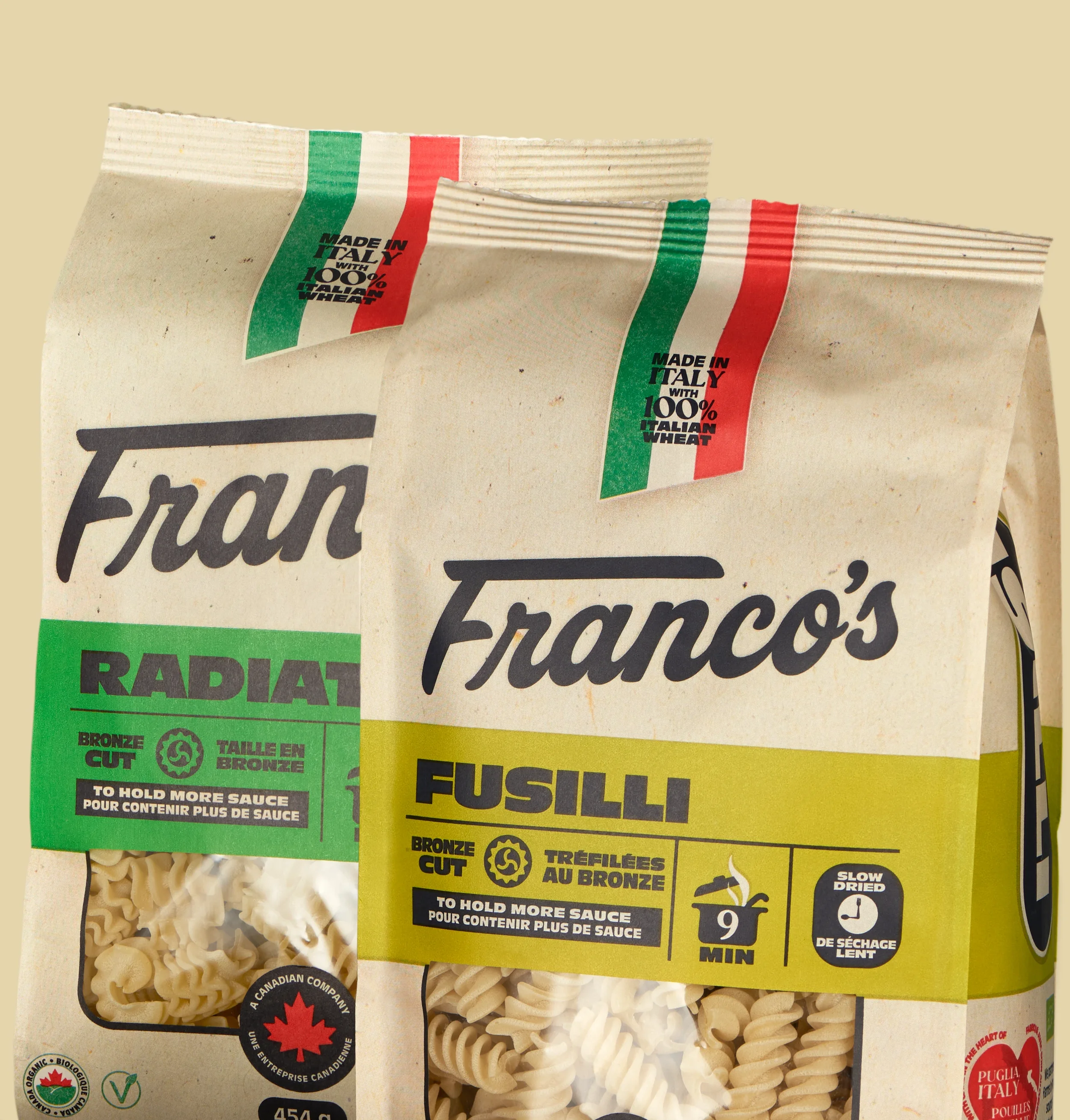
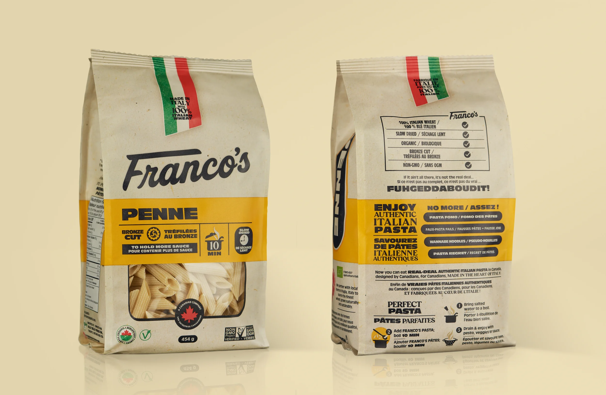
We helped build Franco’s from the ground up, creating a custom-drawn logo and a packaging system with plenty of personality. Bold typography, confident colour blocking and clear product cues gave the brand a distinctive look while keeping the information shoppers need easy to find.
Six Shapes.
One Brand
Each pasta needed to stand on its own while still belonging to Franco’s. A consistent design framework tied the range together, while colour, product naming and individual variant markers made each shape easy to recognise. Six bags. One brand.
Ready for Retail
Franco’s is now on shelves across Ontario at Fortinos and Rabba. For a brand starting from zero, that means showing up with a clear identity from day one — and a packaging system ready to support the next stage of growth.